The Text Editor element is one of the most used content elements, if not the most used. This element is used to add text, links, and other content to the page.
The Text Editor element has a region for titles that can be left blank if you prefer. The title in this element will be formatted similarly to the Title element which is represented through an <h3> in the HTML.
Paragraphs can be either typed manually or pasted in the text region by using the keyboard shortcut (CTRL + V) or by right clicking to produce an options menu and selecting paste from there. Text in the paragraph region can be re-formatted as needed.
Standard Features
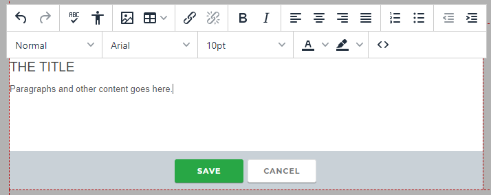
Standard features of the text editor include:
- bold or italicized text
- Alignment: left, center, right, or justified.
- Numbered or bulleted lists
- Adding or decreasing indents
Font Controls
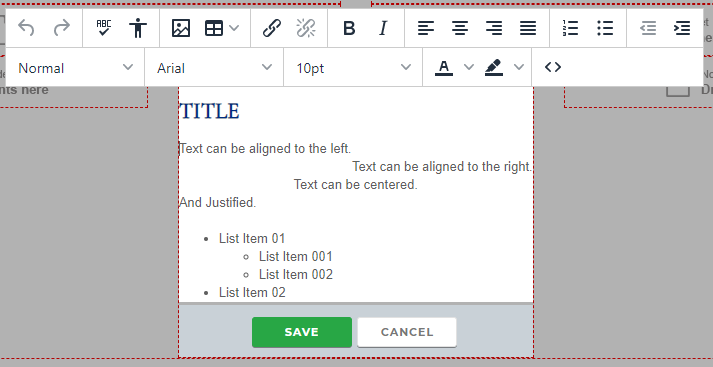
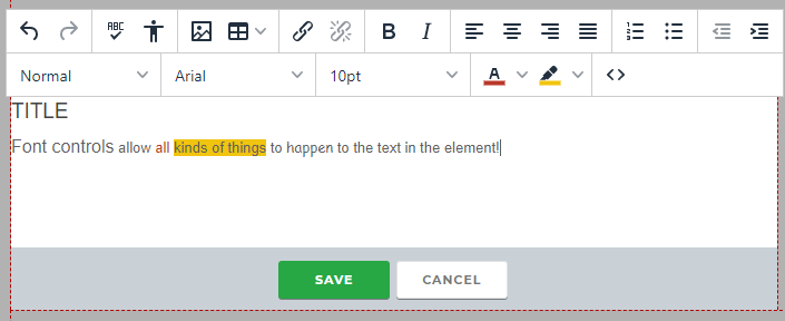
Many districts choose to leave the design's default font controls in place to help keep your design standardized, but Font Controls are an option. Districts may opt to toggle them on via the district’s configuration settings. If you would like font controls, please consult with your district to determine whether these should be turned on, and have your district contact Catapult to make this change if wanted.
When activated, Font Controls offer can be toggled on independently, with font-altering features such as:
1) font size
2) font type
3) text color
4) highlighted color around text
5) text element background
Using HTML in your Text Editor
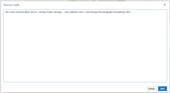
The symbol with the HTML tags allows users with Developer-level access to change parts of the HTML in the text for additional formatting.

Links
If the text you are pasting has a link to a web page or a document, the external links and documents will be carried over. Documents will generally needed to be added to the file manager before being able to be linked.
For instructions on making a link in your text, see the separate article, Making a Link.
Spell Check
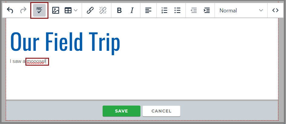
The Spellchecker can be used to double-check the spelling in the element simply by clicking the button labeled ABC, which will then underline any misspelled words with a red squiggly line.
Pictures in the Text Editor
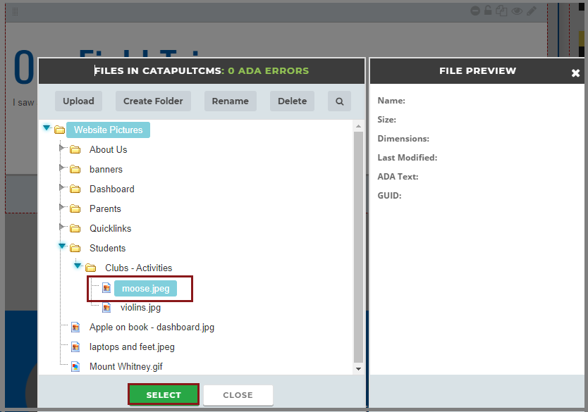
The Picture Selector ![]() allows a user to select an image from the File Manager to place in the element. This frequently used feature is a great tool for placing small thumbnails and icons within an area that has text in need of a visual representation.
allows a user to select an image from the File Manager to place in the element. This frequently used feature is a great tool for placing small thumbnails and icons within an area that has text in need of a visual representation.
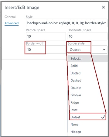
- Right click the image and select "IMAGE."
- Click ADVANCED.
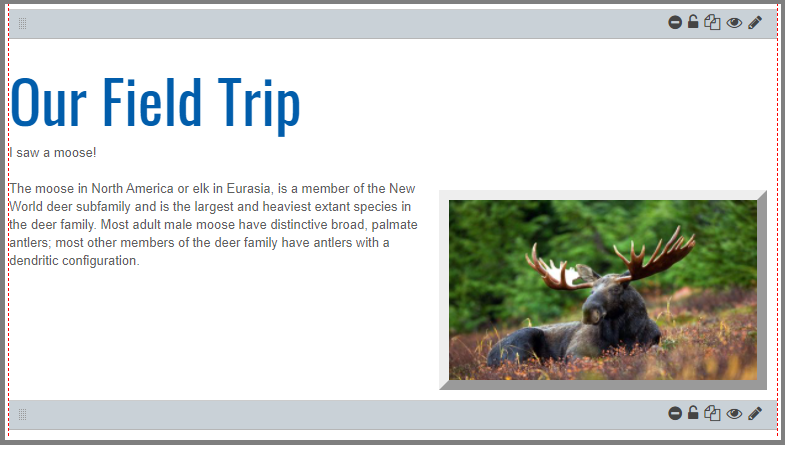
- Add padding in the horizontal or vertical space. 10 px is usually sufficient.
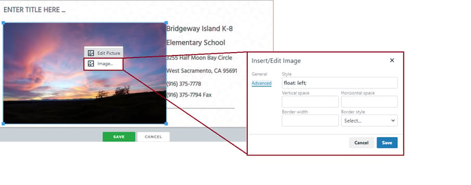
- Add a number in BORDER WIDTH (10 is usually good).
- Choose from the BORDER STYLE dropdown.
